![]()

What is the current state of the market?
As most of you know, we are big fans of Dorsey, Wright & Associates. They had a an interesting article today regarding the valuation level of the market that we thought you all would find interesting.
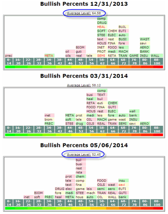
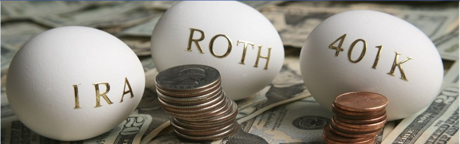
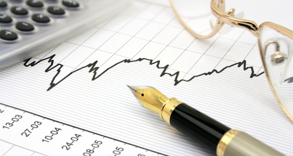
Below are three snapshots of the Sector Bell Curve, providing three different views of what the bell curve, which plots the Sector Bullish Percent readings on a bell curve, looked like on three specific dates. Here we can see three distinct periods, the beginning of 2014 (12/31/2013), the end of the first quarter 2014 (3/31/2014), and the present (5/06/2014). Entering the year, the curve was positioned mostly on the right side, or slightly overbought. The average bullish percent reading was 64.58%, with the majority of sectors to the right of 58%-62% range. There was also only one extremely oversold sector at the beginning of the year - Precious Metals. However, at the end of the first quarter (3/31/2014), the average reading moved down to 58.12%, as more sector bullish percents fell due to some selling pressure in certain areas. Notice how Internet and Biomedics fell to the 34% - 36% range while Precious Metals was one of the few sectors that actually rose during the first quarter of the year, rising up to the 34-36% on the bell curve. Today, we find ourselves with a more normally distributed sector bell curve. The average level is 52.45%, and we have seen most sectors migrate to the middle of the curve. As well, notice how most sectors are back in Os (lower case symbols), as more stocks have moved to sell signals across the market. Overall, the main point here is that the market is less overbought than it was at the beginning of the year, and if we see demand begin to pick back up in some of the oversold sectors, investors could benefit from better entry points and favorable risk-reward scenarios for new positions than what were available at the beginning of the year and even the beginning of the second quarter.