![]()


Relative Strength: Stocks vs Bonds
Relative Strength measures how one security is doing compared to another, how one asset class compares to another or even how one market compares to another. Relative Strength analysis has proven to be a one of the most reliable tools we use to find the strongest sectors in the market and the best performing securities within those sectors. As discussed in more detail below, Relative Strength analysis also tells us whether we should be on offense or defense.
When monitoring the market for deterioration or weakness, we typically find defensive asset classes giving relative strength buy signals over offensive asset classes. Defensive asset classes are lower risk securities, such as Money Market, Fixed Income, and Foreign Currencies. Offensive asset classes are higher risk securities such as Domestic and International Equities.
For example, monitoring the relative strength relationship between domestic stocks and bonds helps us determine if we should be on offense to accumulate welath or on defense to protect it.
In the cart below, you can see how this works. The relative strength comparison between the S&P 500 versus the Barclays Aggregate Bond Index is a long term tool that can be used to determine when to alternate between offensive and defensive strategies.
Notice that in November 2000, this chart gave a sell signal, which meant that stocks were probably going to start underperforming bonds. (This is indicated on the chart where the "B" in the column of O's changes to red - B stands for November.) Thus, this change signaled a shift away from the offense; stocks, to a more defensive asset class, such as bonds.
Then in July 2003, the chart gave a buy signal, which meant it was time to put the offense back on the field and buy stocks. (Where the red changes to green between the 6 - June - and the 7 - July.) This buy signal held up until July 2008 when the column of O's changed from green to red and lasted until June 2009, which was the last signal given by this chart and is in force today. So this Relative Strength chart continues to favor stocks over bonds.
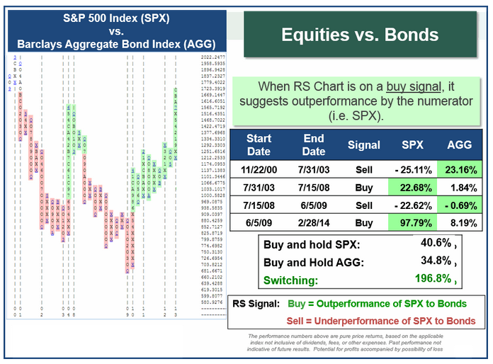
Chart courtesy of Dorsey Wright & Associates
These buy and sell signals are summarized in the boxes to thr right of the Relative Strength chart. By simply following these buy and sell signals from November 2000 through today, an investor would have earned a return of 196.8% - basically doubling his money. This strategy alsoproduced returns that were more than 5 1/2 times the return from buying and holding bonds during the same preiod and almost 4 times the return of buying and holding stocks.
But great returns aren't the only thing this strategy provides, it also provides peac of mind since the only period of loss was from 7/15/08 to 6/5/09 and that was limited to just -0.69%.
Bottom line, Relative Strength analysis is one of our most important tools and it allows our clients to earn higher returns while risking less.